Ryman Healthcare
Ryman Healthcare is a leading retirement living and aged-care provider operating across New Zealand and Australia, delivering integrated village living and care services that support older adults as their needs evolve.
Challenge
Ryman’s resident app was outdated, clunky to navigate, and did not reflect the high level of care and community experience the brand delivers. The existing experience made it difficult for residents, many of whom have varying levels of digital comfort, to access important features like activity schedules, care updates, community news, and support services. The goal was to modernise the app so it felt intuitive, dependable, and truly helpful for everyday use.
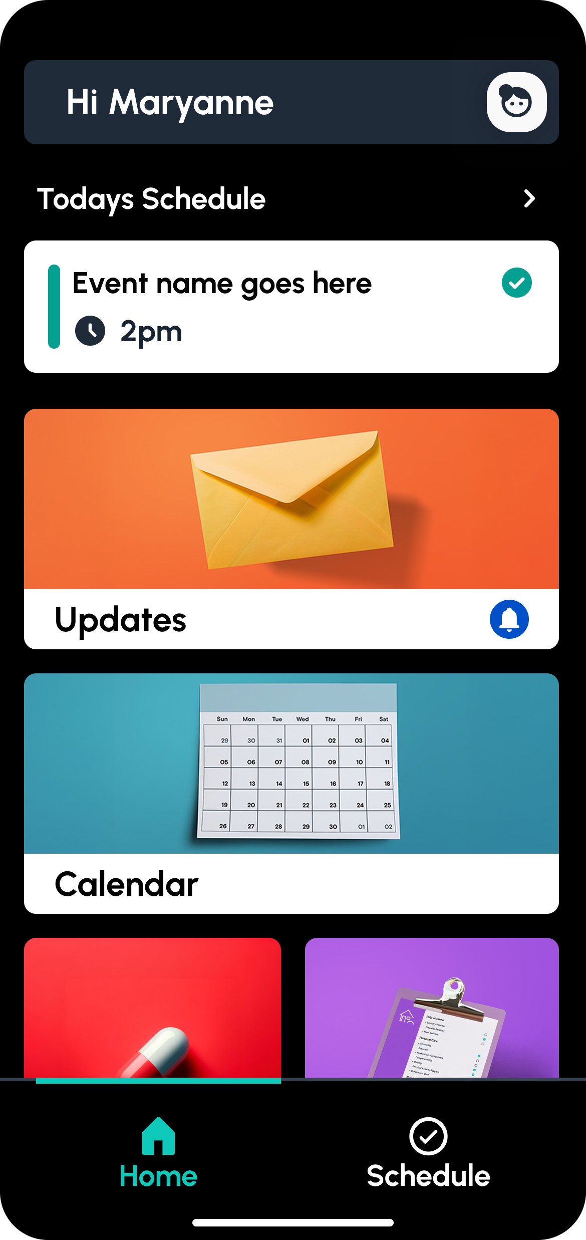
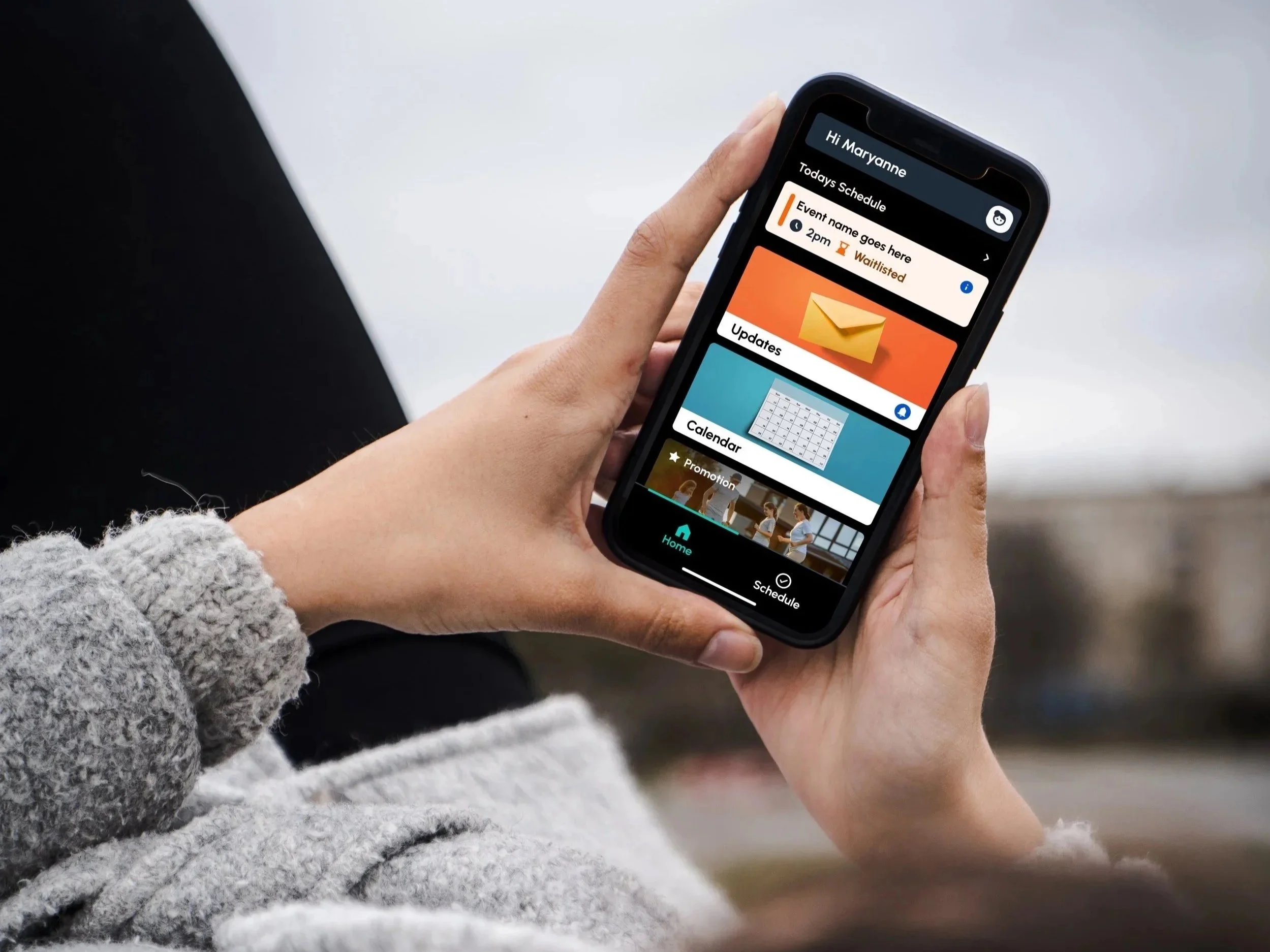
I redesigned Ryman’s resident mobile app with a focus on clarity, accessibility, and ease of use. The redesign brought a structured, human-centred interface that made key tasks more discoverable and simpler to complete. This included improving navigation, prioritising core features like notifications and support access, and refining visual hierarchy so residents could engage with the content they needed most without confusion. The result is an app that reflects Ryman’s commitment to quality care while empowering users with a friendly and supportive digital tool.
Key Features and Design Decisions
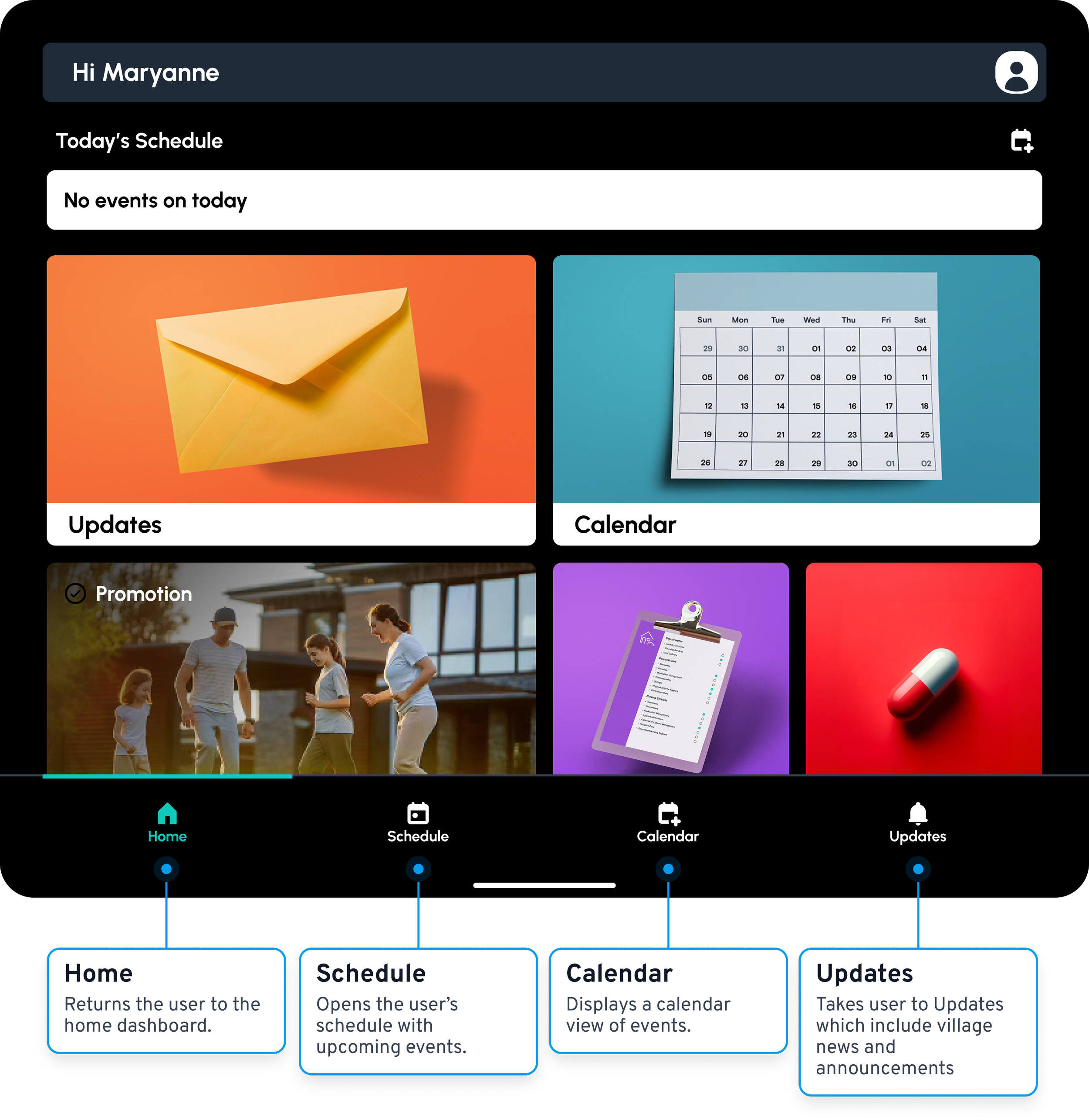
Simplified navigation — A clear bottom navigation bar ensures the most frequently used sections are always within reach.
Readable content hierarchy — Larger type, consistent spacing, and clear icons improve scanability and reduce cognitive load.
Actionable notifications — Residents can see important updates at a glance and act on them quickly.
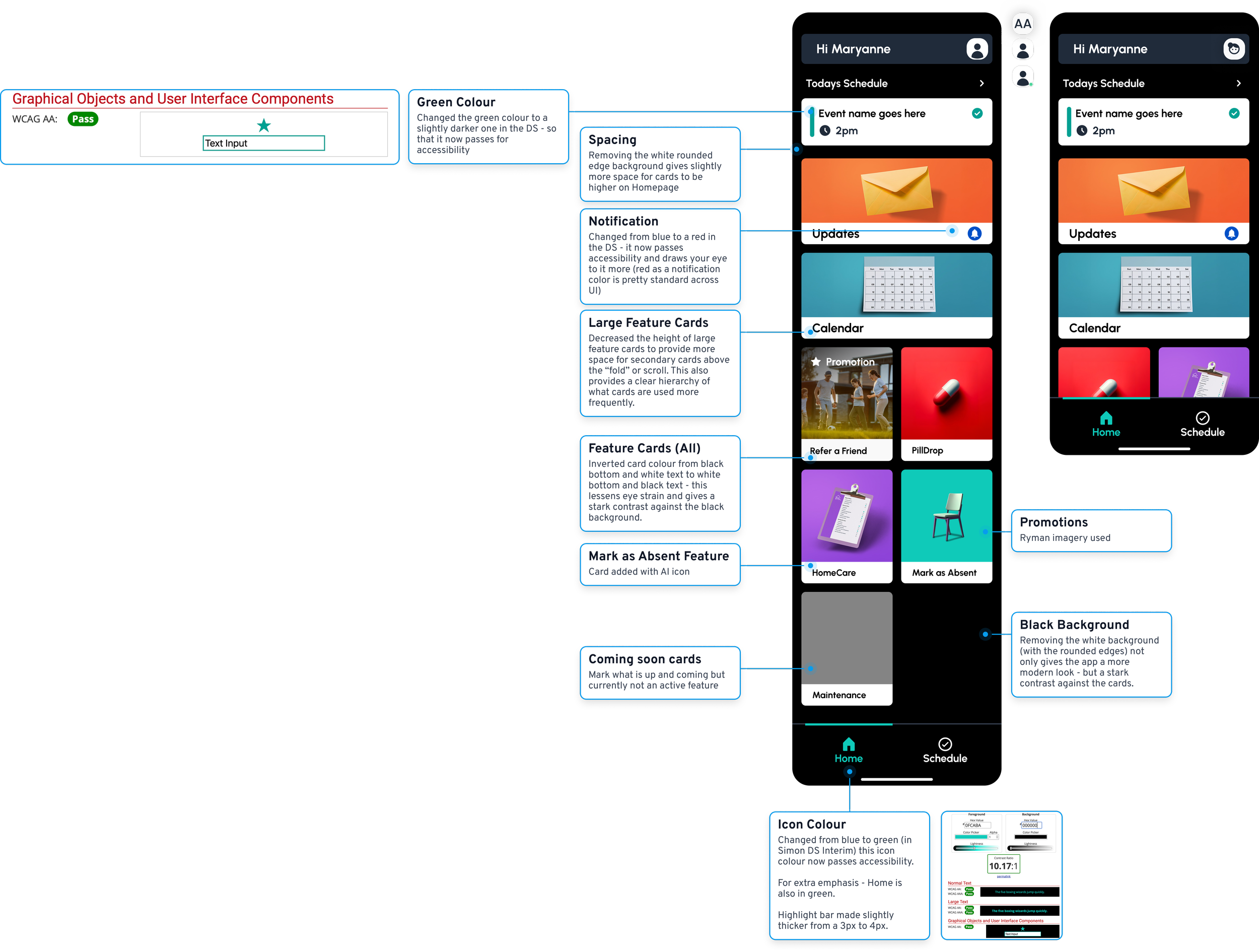
Accessible interactions — Touch targets, contrast, and layouts were fine-tuned with accessibility in mind so users of all abilities can interact with confidence.
Designing Clear Error States
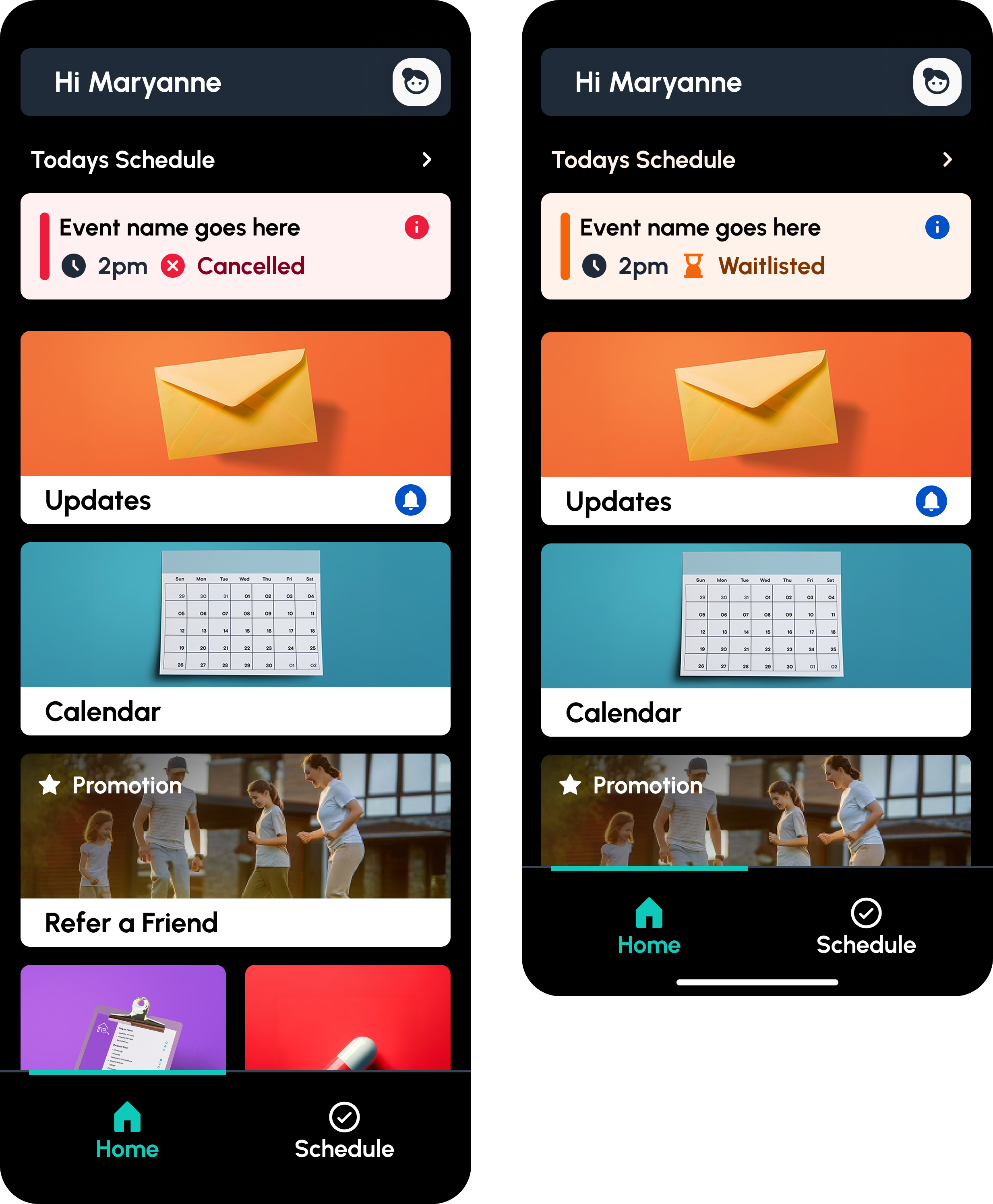
As part of the redesign, I introduced a clear and considered system of error states to help residents understand what went wrong and what to do next. Rather than relying on generic system messages, each error state was designed to be calm, human, and supportive, using plain language and clear visual cues.
The approach focused on reducing anxiety and confusion by explaining issues in simple terms, offering clear next steps, and avoiding technical jargon. This ensured residents could recover from errors confidently, whether it was a failed action, a connectivity issue, or missing information, without feeling overwhelmed or at fault.
Outcome
The redesigned app delivered measurable improvements in usability and engagement. Task completion times decreased by an estimated 30 percent, and user feedback highlighted a stronger sense of confidence and independence when interacting with the app. Importantly, the new design reflects Ryman’s values of supportive care and community living in a digital context, helping residents stay connected and informed.
This project was an opportunity to translate Ryman Healthcare’s deep commitment to residents into a clearer, more empowering digital experience. By focusing on usability, accessibility, and empathy in design, the app now better supports residents’ day-to-day lives and reinforces the organisation’s reputation for quality care.
Developer Annotations and Handoff
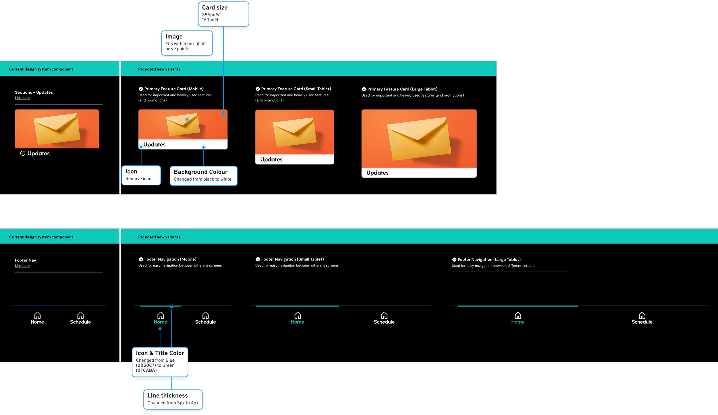
To ensure a smooth transition from design to development, I introduced detailed developer annotations across key screens and flows. These annotations documented component behaviour, spacing, states, accessibility considerations, and edge cases, reducing ambiguity and supporting accurate implementation.
By clearly defining interactions, error handling, and responsive behaviour upfront, the annotations helped streamline development, minimise back-and-forth, and maintain design integrity through to build. This approach enabled the team to move faster while ensuring the final product closely matched the intended user experience.
