RAC Parks and Resorts
This case study details of the large-scale redesign and build of the Parks and Resorts website, a site owned by RAC (Royal Automobile Club) in Western Australia.
Background & Problem Statement
Beginning in July 2021, the project is focused on developing a user-friendly website to streamline online booking processes, reducing the reliance on phone and email reservations. The primary objective is to boost online booking conversions, consequently reducing the number of phone and email bookings.
Risks
This project needed to be addressed as soon as possible as we moved towards a 'one RAC' approach and the website redevelopment would allow us to update the look and feel of the website to be more aligned to the main website, rac.com.au. If the project is not undertaken, we risk increased pressure on our park/resort staff with phone calls and emails of guests wanting to make bookings after not being able to do so online. We also risk downtime with the website as there are many vulnerabilities with the current website, limiting the number of enhancements we can make. Vulnerability of website is critical, the CSS NRMA have transferred is causing issues with updates and are breaking things.
Project Goals
Increase online and direct booking conversion (1.5%)
Align the UX look and feel to the rac.com.au website
Improve stability of the website (One CSS, with limited plugins at completion)
Decrease in customer calls, target the ratio of increasing online bookings
Project Scope
Myself (UX Design Lead): 50% hands on design & 50% people leadership and project management
UI Designer: My direct report responsible for turning wireframes and research into low and high-fidelity prototypes
Two internal product (Travel) stakeholders
Brand & Marketing stakeholders
Legal & Compliance stakeholders
3rd party companies for SEO feedback, Analytics & Developers
Potential Challenges
The Newbook booking system's capabilities are falling short in providing optimal User Interface (UI), resulting in the inability to meet the conversion goals along the purchase path.
Toolkit
Figma
Hotjar
Usertesting.com
Asana (for project management)
Confluence & Dovetail (to house research)
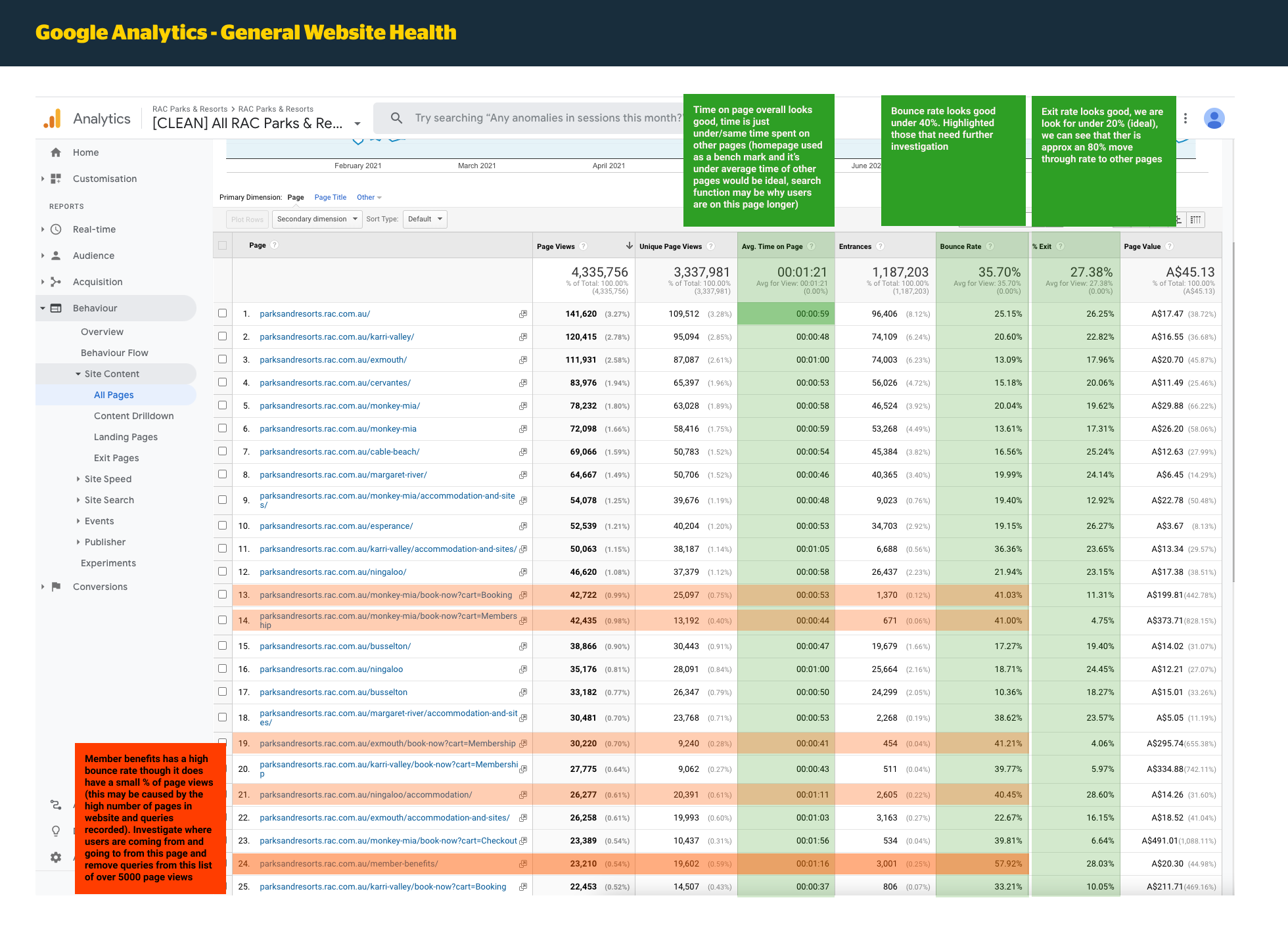
Google Analytics
How I’m tracking success
Newbook for revenue this is displayed in PowerBI, tracks where revenue comes from
Google Analytics
overall website traffic
Source of traffic - organic, paid, email
Bounce
E-commerce conversion rate
Top performing pages are to see where bookings are coming from acquisition source
‘Last click’ attribution in GA
Qualtrics data records survey information for post-stays
Referral report which sites are referring, which ones can boost
Initial Research & Assumptions
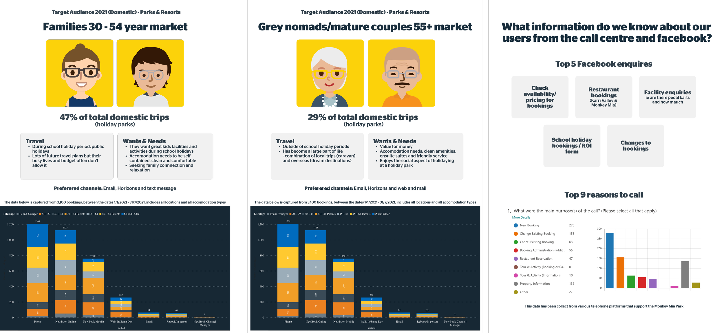
Calls:
RAC gets charged for every call to the 1800 number. Looking to direct a bigger proportion of bookings to the website.
Based on the call centre data captured in the calls to Monkey Mia (one of the locations), the number one reason for calls to make a booking, second is changing a booking, third is for property information. In current research, we can see the people who are booking camp sites 48% call more than those who book cabins 33% and dorms, there might be more info on website about cabins so people who book campsites need to call.
Audience:
Local, interstate, international audience
Core is families (includes single parents), nomads 60+ (a lot from eastern states and caravaners.
People looking to book in school holidays
People who enjoy traveling
People who travel in Western Australia
Design Process
Our design process was efficient with me as the project lead, Parks and Resorts product owners, UI Designer, and external SEO and analytics agencies. I created a detailed design calendar based on deadlines and needs, breaking down the site into manageable sections. I conducted stakeholder interviews, research, and created the initial sketches. I worked closely with the UI Designer to address user challenges and successes, creating low-fidelity prototypes for review. We held design meetings to gather feedback and make necessary edits before moving on to the next phase. I coordinated with third-party developers for site development and testing until product launch.
The entire re-development can be broken down into four stages using the typical double diamond. method: Discover, Define, Develop and Deliver.
Discover – The discovery stage was. all about exploration and observation. The goals of this stage were to understand the product context. Get to know stakeholders to better understand the project’s relationships, analyse any available data, and think about necessary research and the target user/audience.
Define – This stage was all about interpretation and defining. The goals of this stage were to understand the expectations and needs of the user. This is where we determine the design challenge and create the first proposals of what values and critical features the product should have.
Develop – The development stage, where we sat for most of the project, is centred around ideation. Here is where we create solutions, solve problems, and push the project to the next stage. (Think: Lots of prototypes, wireframing, and designing in Figma).
Deliver – The deliver stage, is about building, testing, learning, and repeating as necessary. This is where we verified our solutions and gained knowledge about the project from a member’s perspective. Many data and insights come out of this stage that helps with future optimizations. (Think: User testing).
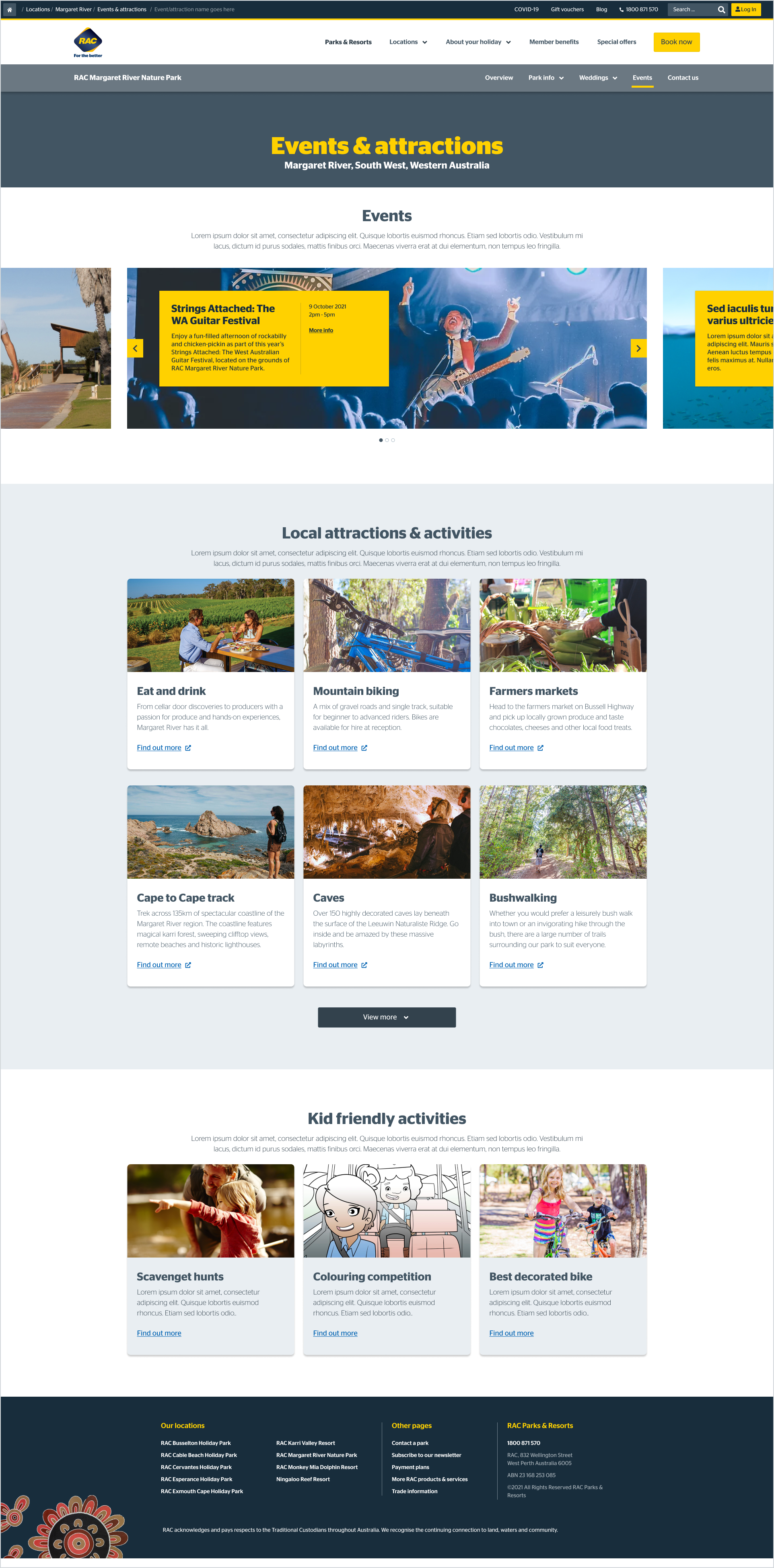
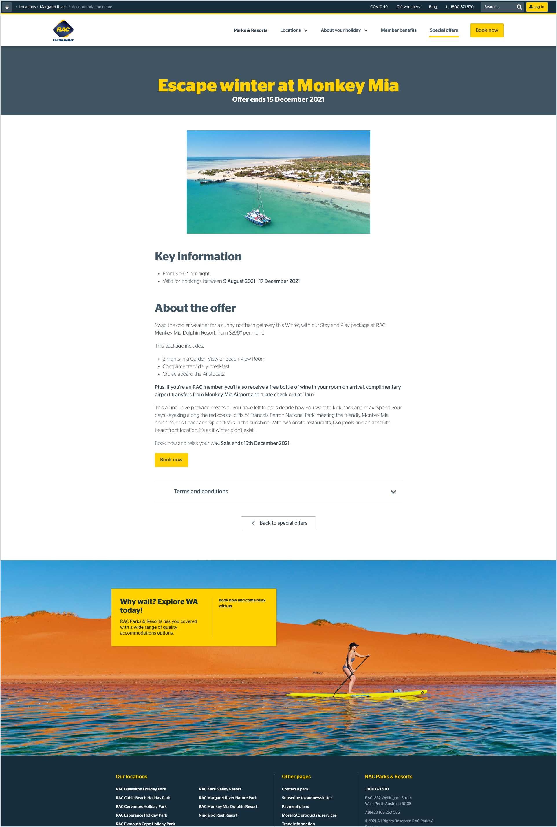
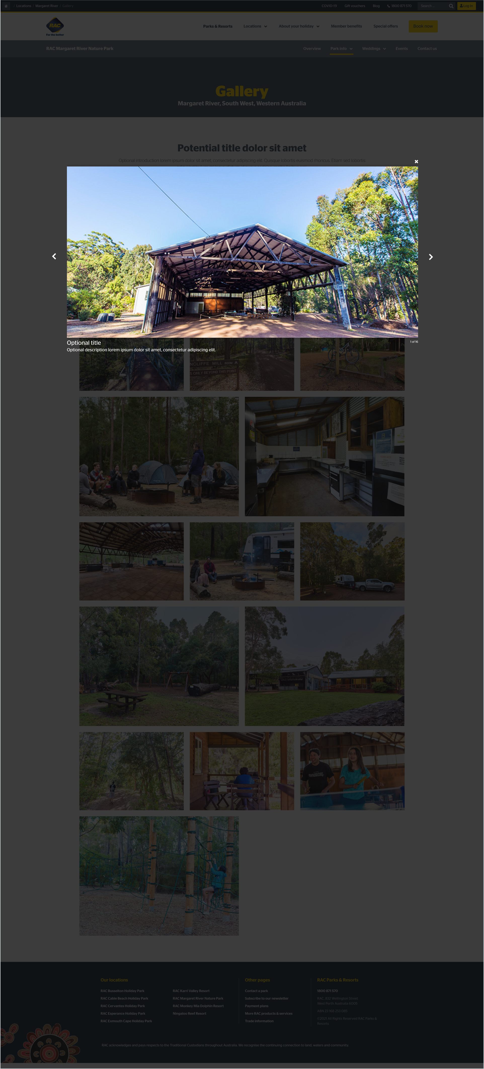
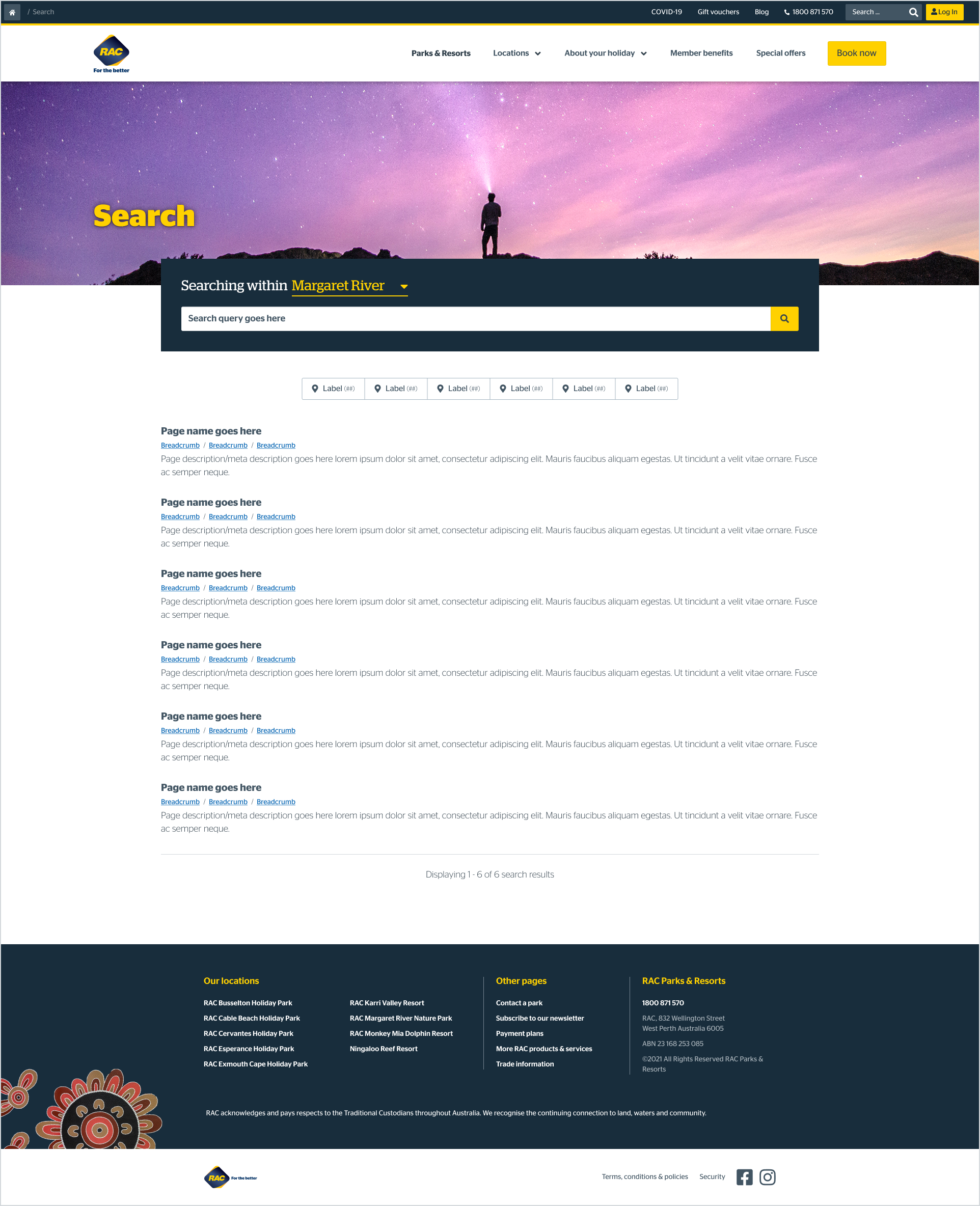
Features & Functionalities to resolve user needs
A clean, clear, and concise UX for users
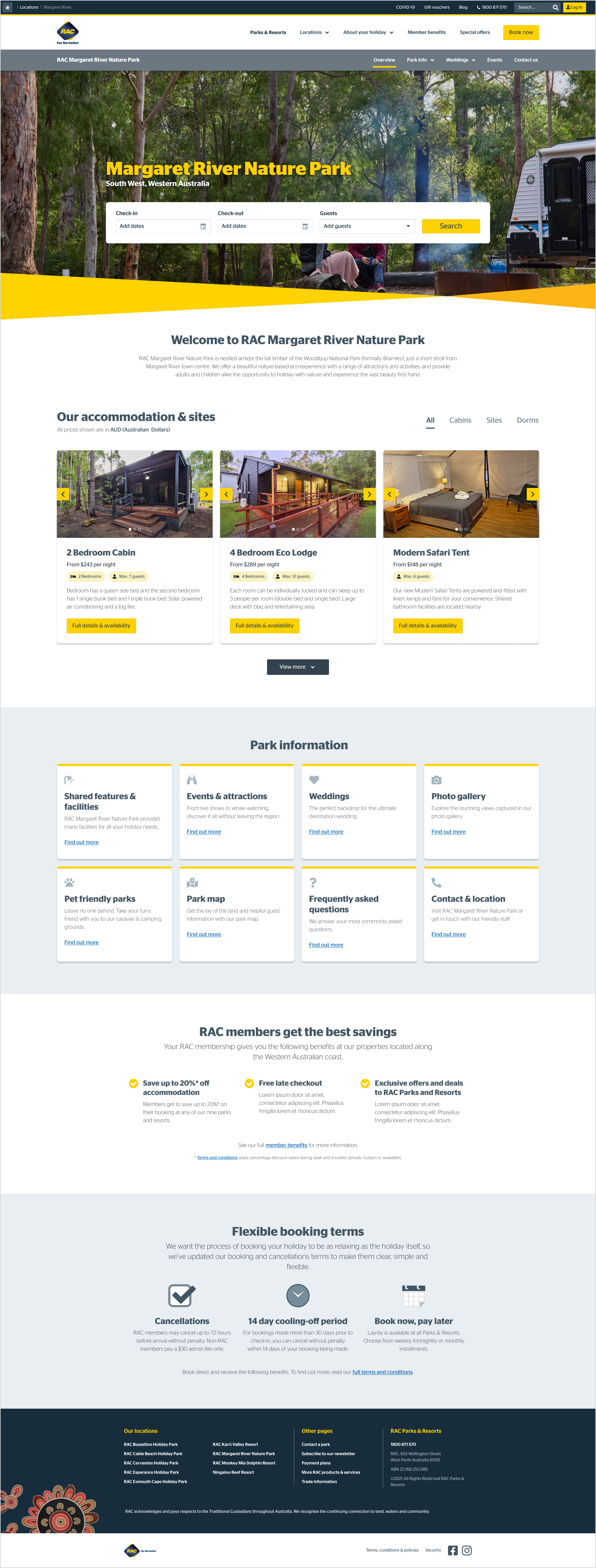
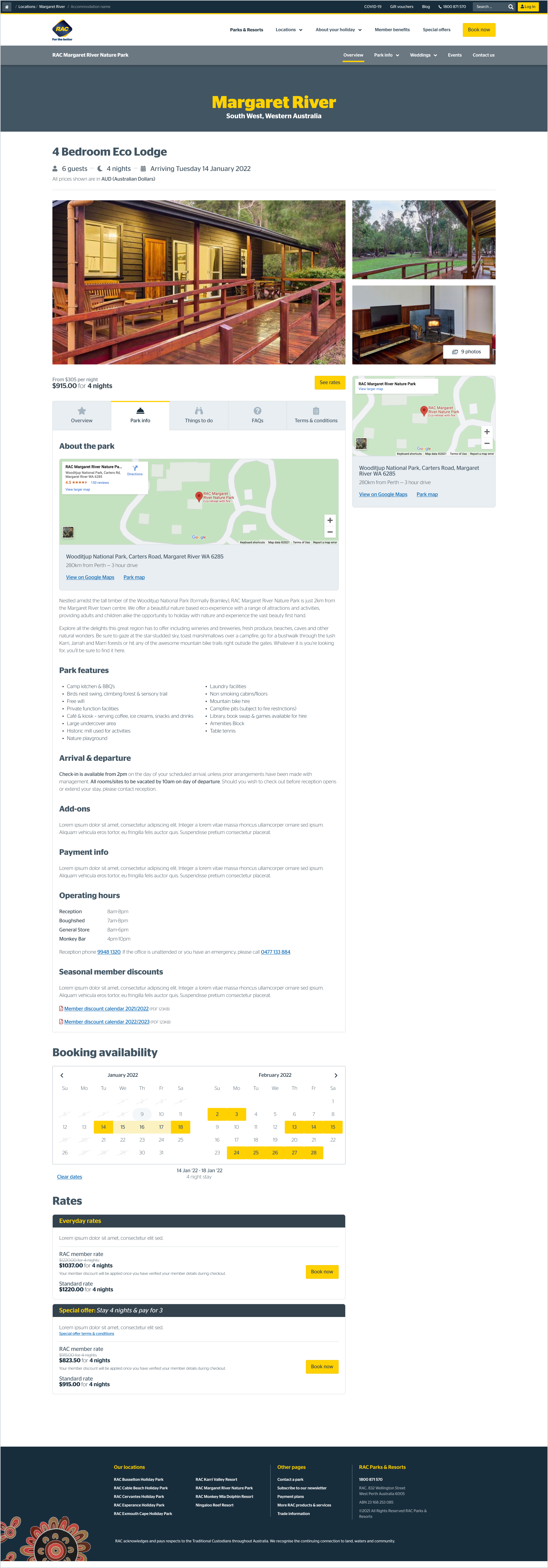
Clear information pages detailing park information
Ease of booking for users through a simplified user flow and clear CTA’s
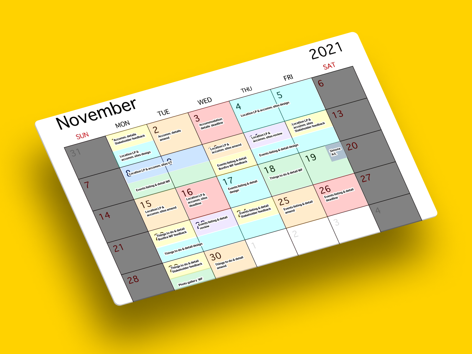
Design calendar (image above)
Because of this fast and furious process, it was my responsibility to make sure our design and development process stayed on track and gave oversight and transparency to where we were at every step of the journey.
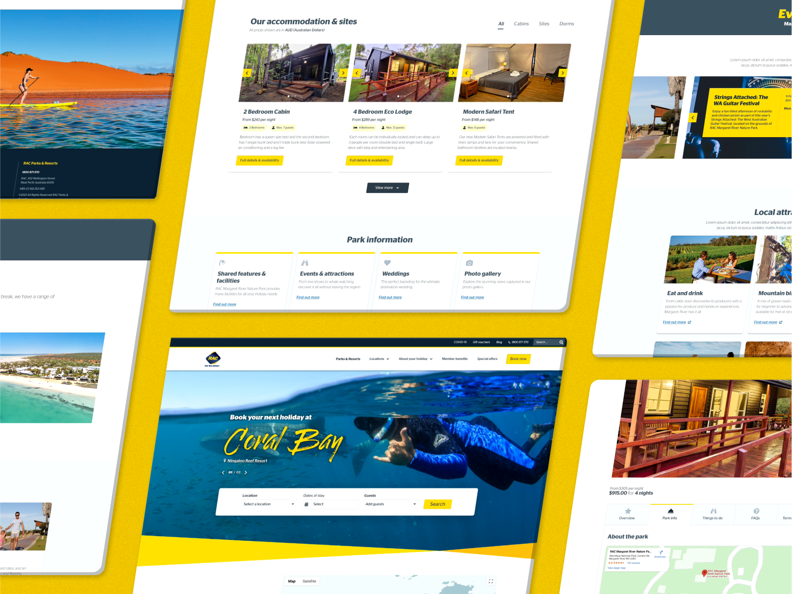
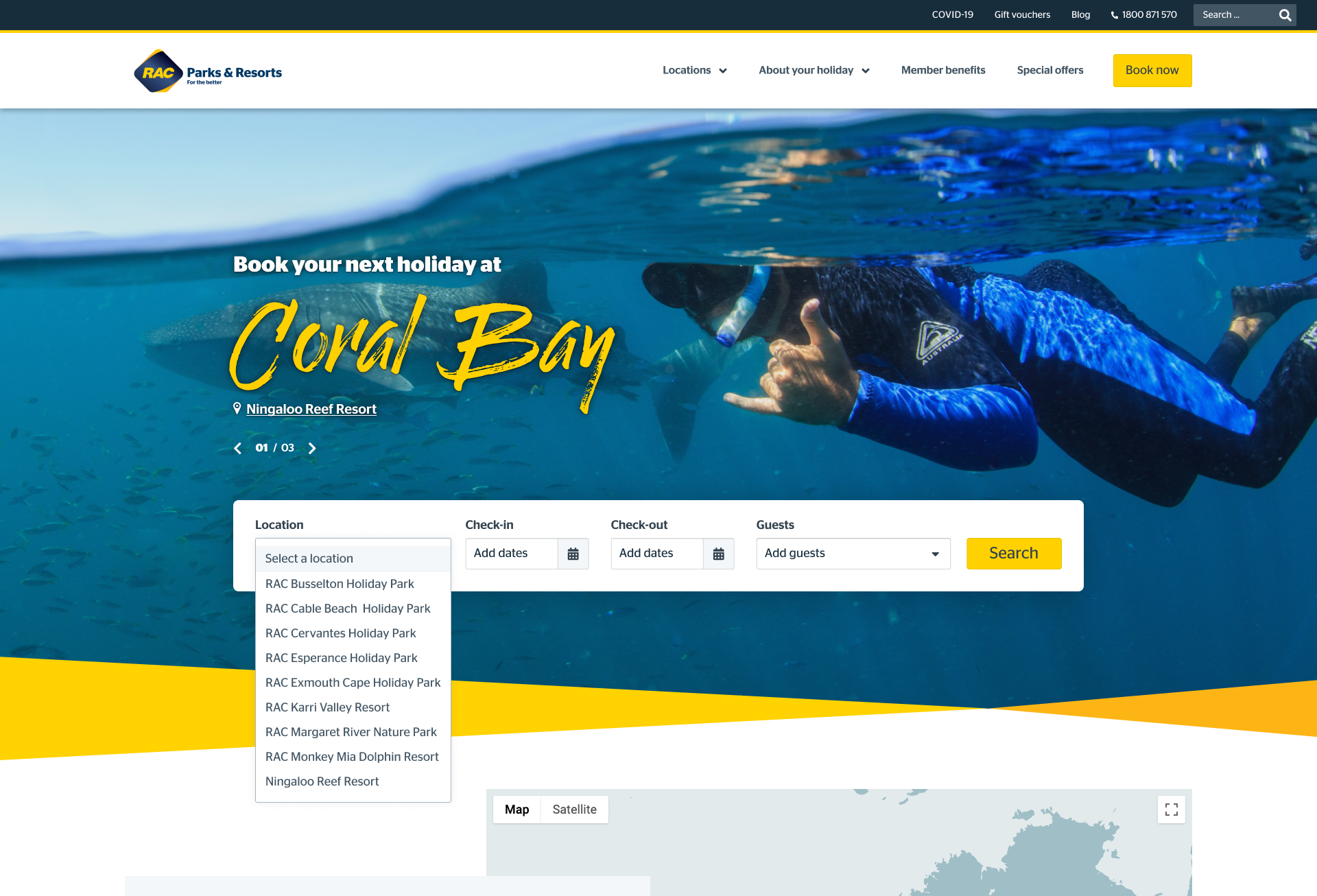
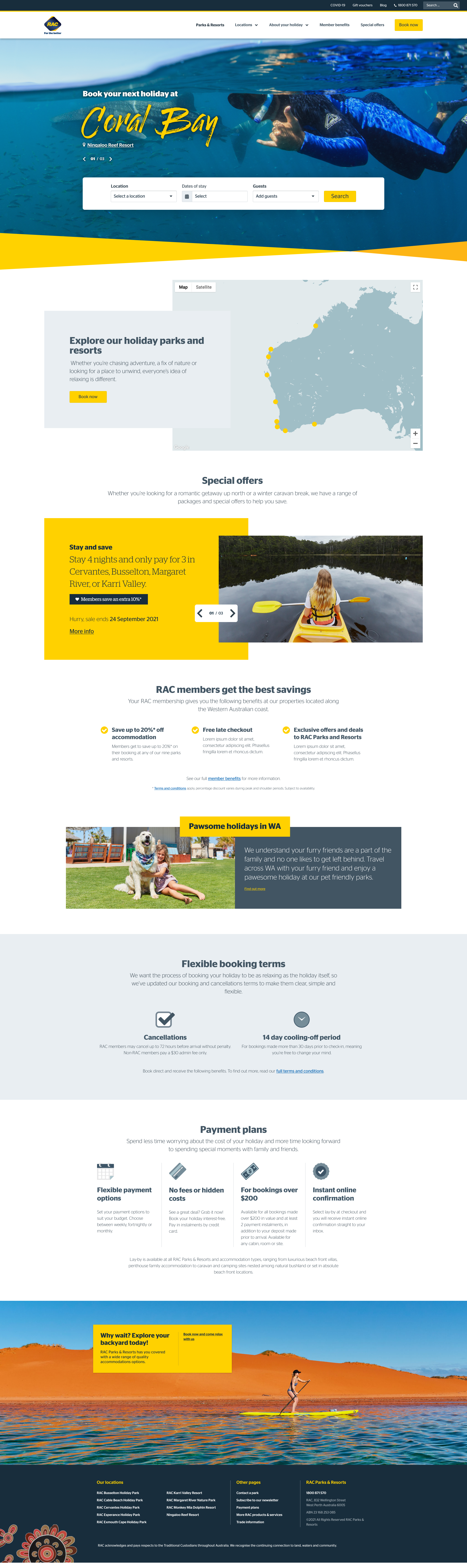
While our site was re-designed, the comprehensive sitemap and structure were refined based on user testing to create a more efficient, seamless end-to-end user experience.
User Testing
“Supposing is good but finding out is better.” – Mark Twain.
We’ve run user testing in batches as we work through the design process.
With usertesting.com, we’ve run moderated and unmoderated tests for mobile and desktop design with 5-10 participants (member and non-members alike) per test.
Of the 85 participants:
Ages varied in range from 26 to 52
All the participants either currently, or previously, resided in Western Australia.
84% of participants tested are or were RAC members.
20% have booked a stay with parks and resorts in the past
60% of our participant’s books on mobile and desktop
20% book on desktop only
20% book on mobile only
We ran 16 user tests from the start of the project to April 2022, when our user testing concluded, culminating in 1310 minutes (22 hours) of recorded feedback.
Member Feedback
Throughout the user testing process, we’ve received numerous valuable insights from our members (and non-members) that have validated our hypotheses or changed the course of our direction for an even better user experience.
What members responded well to
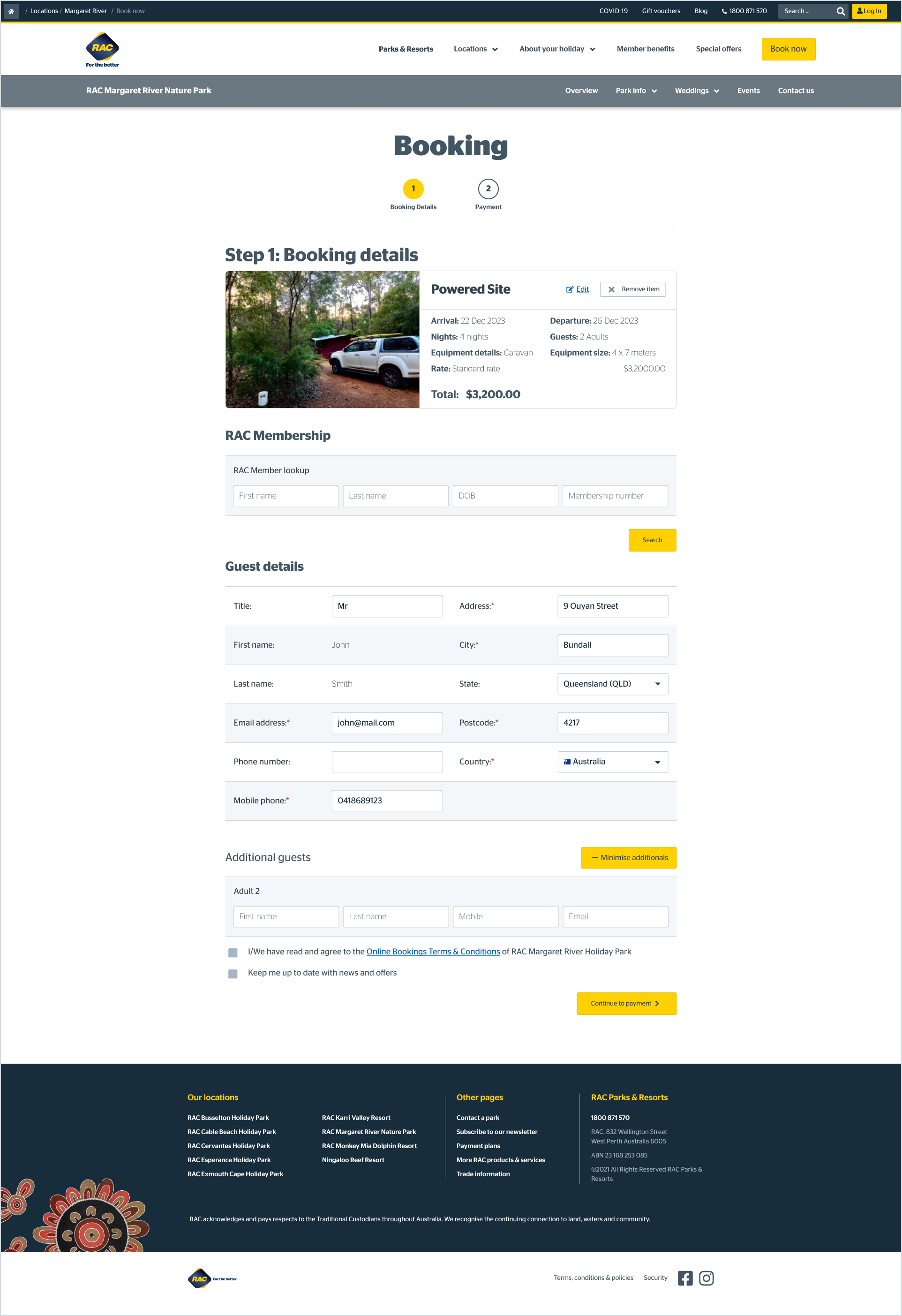
We found that it was a consensus that those who had previous experience booking a stay at a parks and resorts location or were familiar with the old site saw a drastic improvement in the layout, design, and content provided with the re-design. Some of the critical callouts were:
The improved booking steps
The imagery and iconography throughout the entire purchasing journey
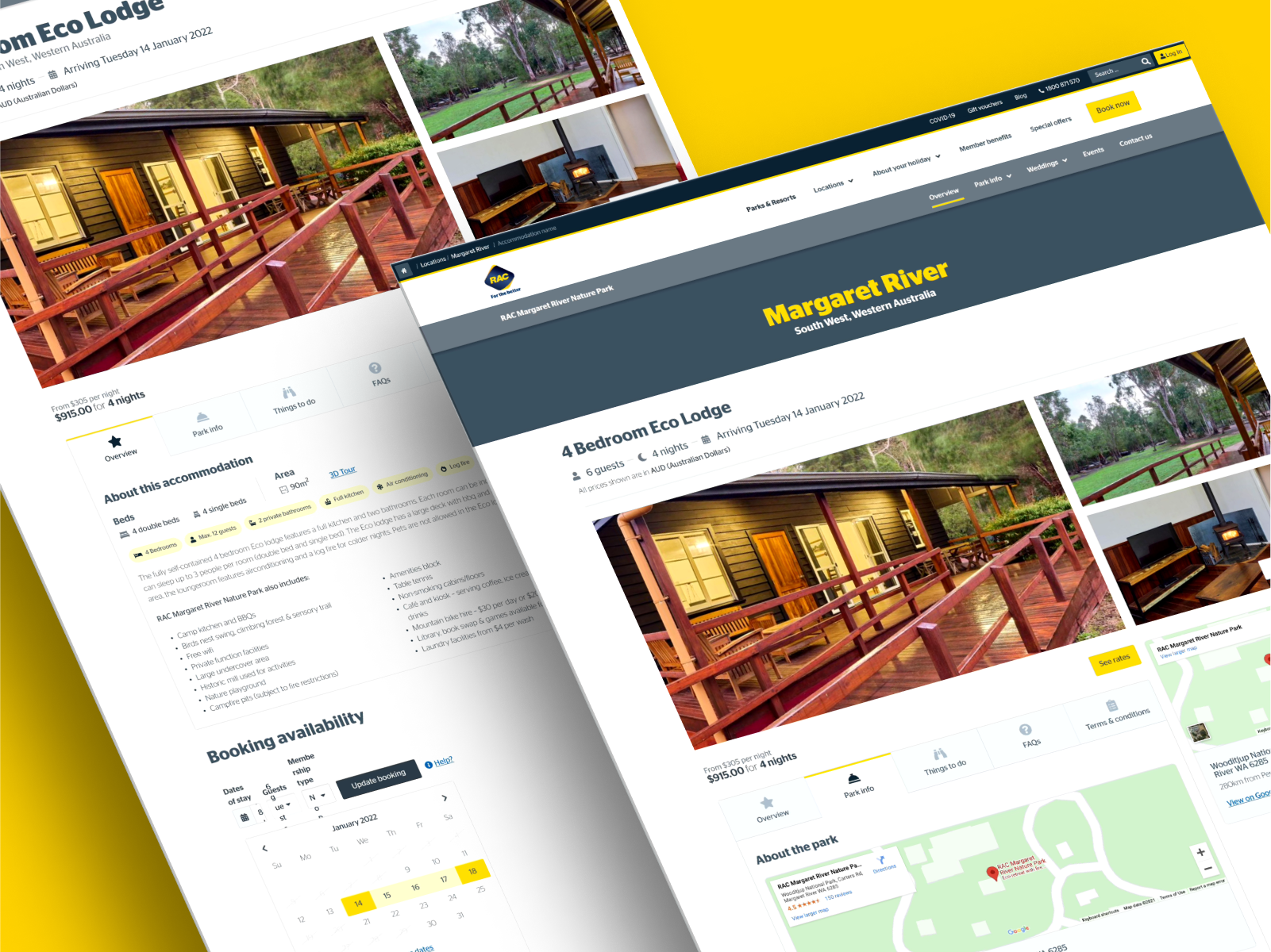
The addition of an accommodation detail page housing tabs with all necessary information about booking/staying at a location
The overall improvement to site layout and hierarchy
Praising the re-design as “clean, professional, seamless and trusted.”
Discovery Findings
UX review
To make a group booking, update or cancel a booking users must call
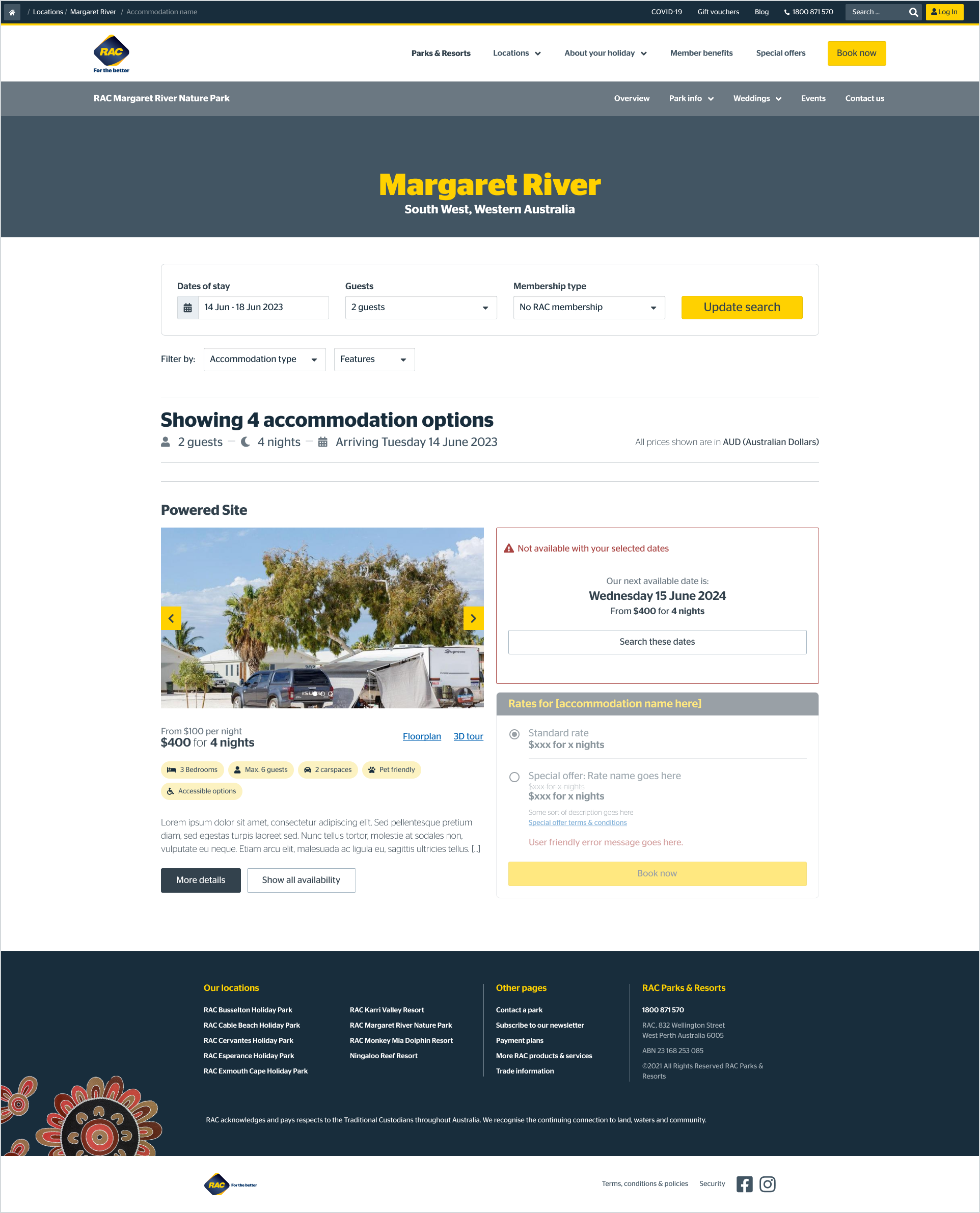
On the search results page users are unable to filter accommodation options based on their needs including users with accessibility or mobility issues, pet owners or families
Availability messaging is inconsistent across the 9 sites
Most users wanted to know where parks are located and expected to see a map
A third of users wanted to know activities and things to do near the park
All users who have tried to book during school holidays stated they experienced website crashes and/or slow page loads
Search results do not reflect the users search criteria resulting in most users struggling to understand the available options to them
Most users were confused by the display of rates and prices
Users who were shown the option to see next availability for an unavailable accommodation option, liked the functionality
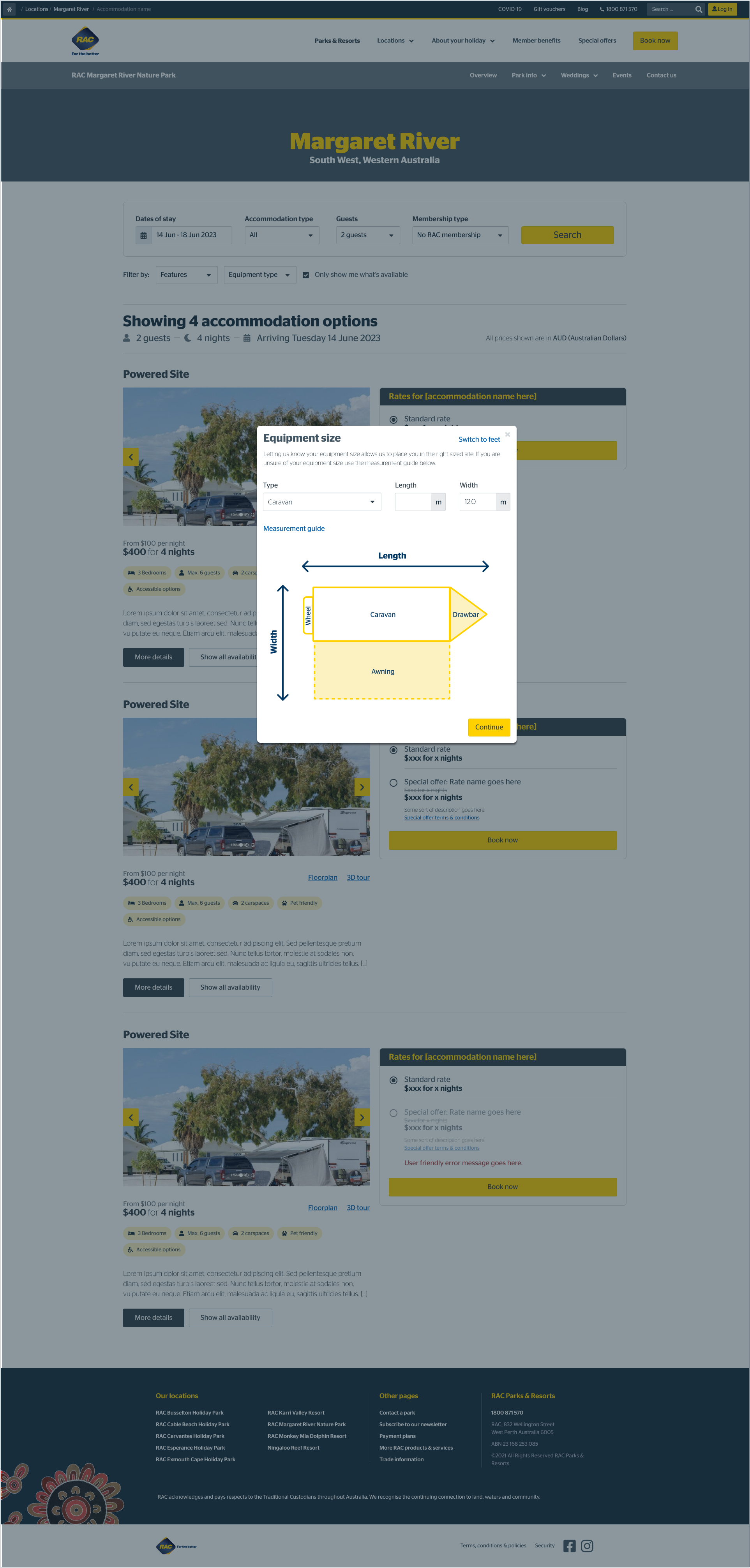
More than half of Members were confused when their member discount was not applied to their cart - the discount is applied after they log in on the next step however, this is not communicated
A third of members misunderstood when they were asked to add membership details and instead selected “add a membership” - which adds a membership purchase to the cart
Users can proceed to payment without validating their membership details in the booking process
All users who tried to change their dates during the booking process were not able to because the system does not allow them to go back
Users who liked the option to pay by a payment plan could not work out how to see the payment plan details
Where I pivoted
The beauty of user testing is not only the positive comments you receive, validating all your hard work but the observations, pain points, and suggestions that lead to a better product.
Since we completed the design and testing phases in batches, the bulk of user testing centred around specific pages at a time leading to feedback about the functionality and content on that set of pages, which led to some shifting of information hierarchy, swapping out content and re-vising our copy to improve clarity.
Once most of the pages were ready to go in our staging site, and we ran moderated end-to-end testing on the purchasing journey, we got to see members interact with more of the features at once. One example of a pain point discovered in this process was the calendar that popped up when making a booking.
The calendar in staging featured dates that were in the past with a singular slash through the day, marking it as unavailable. It also featured dates in the future that were booked out, with a double slash or ‘X’ across the day, marking those dates as unavailable.
We were seeing users struggle a bit with this functionality and conferring with other team members and comparing calendars that were used across the business, the re-design of the calendar with a consolidated ‘date not available’ marking decreased user confusion and provided Sunrise, our design system, with an updated look and feel of a more seamless calendar to use across the wider business.
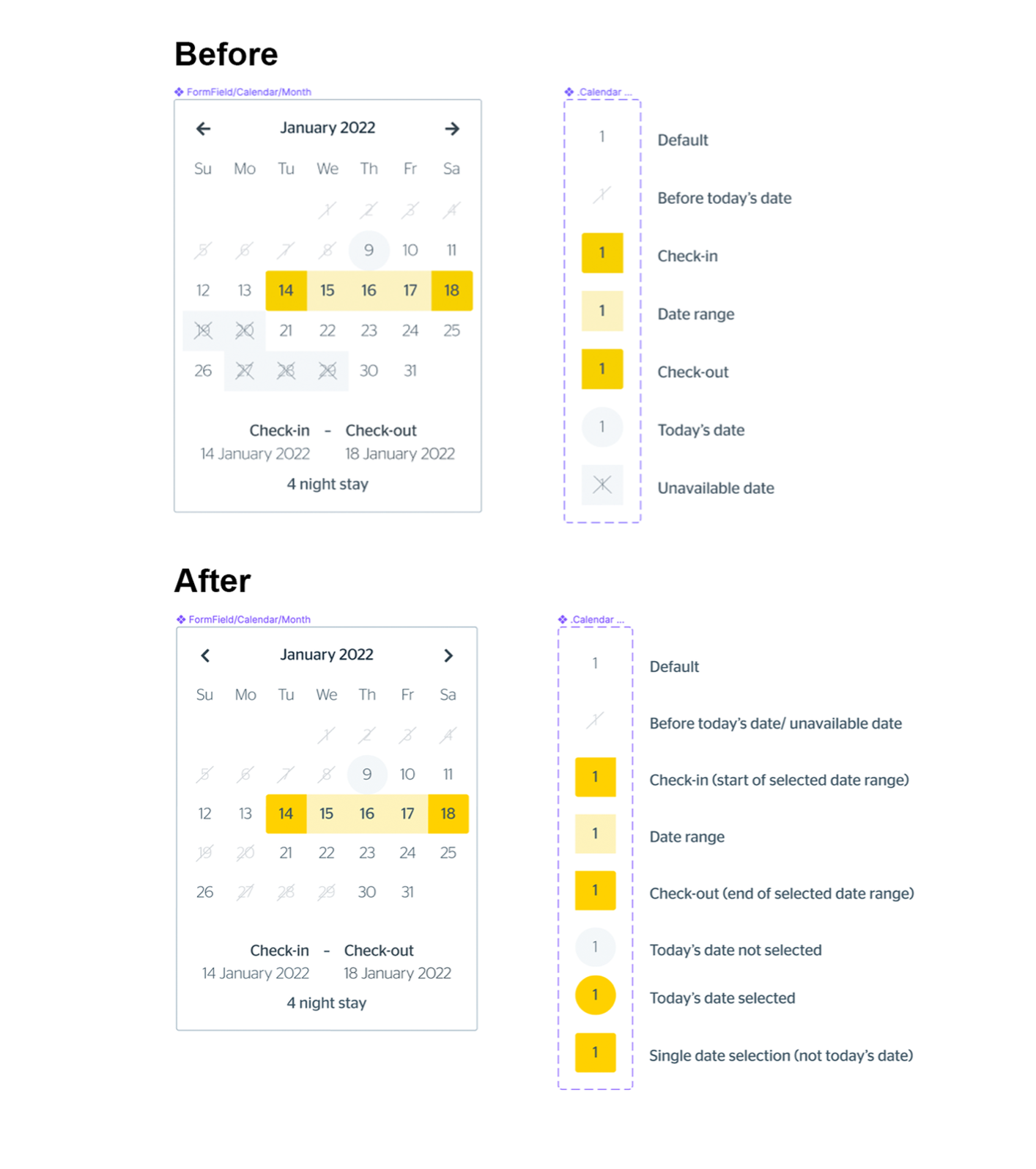
Booking Calendar
Booking calendar before and after testing/feedback
The Good, The Bad, and The Ugly: Key Project Learnings and Takeaways
“Success is walking from failure to failure with no loss of enthusiasm” – Winston Churchill.
What has gone well
We’ve seen the design and flow of the booking process that was validated through both our user testing and feedback from internal stakeholders. Words like clean, professional, polished & trustworthy are mirrored in the tests we’ve run throughout our pages with members and non-members alike. It’s been exciting to see the positive feedback we’re receiving on these pages from our participants, explicitly witnessing the excitement from our members who wish to continue to use this site once it’s launched.
Using the Design System has also been a success. While some new components were created, we still used the existing features where they were appropriate or took the existing components to create something new. If I could sum up the success in one sentence of what delivery best practice worked well it was to communicate early and often.
What was overcome
Time was the most significant factor here when it came to making hard decisions. As you can see above from our packed calendar, the tight timeline leaves no room for error, and adding even the smallest of additional changes can cause delays to the original scope. We saw earlier in the process that with the addition of some extra user testing and page creation, we needed to extend the design calendar by two additional months.
Our ways of working also posed another exciting challenge for us. Since the design & development were happening simultaneously, in that batch timeline, once we validated and decided on our key elements and flows, it was already starting to be developed. This made it extra important that when we conducted user testing to ensure we didn’t need to go back into the design later and make any significant structural changes.
The hardest by far from a design perspective with purely just the limitations from NewBook, the platform used for the booking flow, which meant some pages were a re-skin only of the old site, which was entirely out of our control and meant we had to get creative with how we improved that user flow using the tools we had.
The Final Product and Optimisation
After almost a year of hard work, multiple team members engaged from the beginning, long design hours, and careful testing, the site launched on June 20, 2022, here.
At our Post-mortem retrospection 6 months post launch, we saw that we had succeeded in reaching our 1.5%. conversion rate and exceeded it by hitting 1.9%.